Boxes of matches used to be a familiar printed matter and were regarded fondly by people. But as a throw-away object, their life tends to be short. I embrace their fate and continue to collect them as a record of our everyday life.
Japan export to Europe, Meiji – Taisho era, 37 x 56 mm
I have been collecting for 30 years (labels and skillets 50,000+).
My collection mainly focuses on Japanese labels for export matchboxes in the Meiji – Taisho era (1868 – 1926).
I am also interested in Japanese advertisement matchboxes used for pro-war propaganda produced just before Japan’s defeat in WWII.
Some of these labels are shown in the gallery below, click on an image to enlarge it.
Matchboxes caught my attention when I was 11 years old. I started the collection imitating a cousin. At first it was a game and an excuse to escape from the family farm to explore the shops and tobacco shop. Stéphane
Casque d’or label, 50 x 35 mm
Exploring the attics didn’t turn out, but I found “Casque d’or” box, dated mid-1920s, in a drawer at my grandparents’ house, a treasure for me at this time !
The virus for good infected me in 1994, at random from a newsstand, when I discovered the existence of L’Association Vitolphilique et Philumenique Francaise (AVPF) through a classified ad from a collector in a specialized newspaper. I was then 22 years old and began to search for old boxes.
I immediately made the choice to limit my collection to complete French boxes and to go back as closely as possible to the origins of this everyday object. My oldest box is from the end of the 1830s.
From before 1950 I have about 3500 complete boxes including 1000 from before the monopoly established in 1872. Over time I have also collected labels, especially for advertising boxes from the 1920s / 1930s some of which are very rare. Since 2008 I have been in charge of writing the magazine of AVPF and since 2011 chairman of the AVPF.
I collect many things but matchbox labels and related items hold my strongest interest. Having been involved in the hobby for more than fifty years I find myself particularly interested in the weird and wonderful and in this respect phillumeny doesn’t disappoint, I still find things that I would never even imagined could exist.
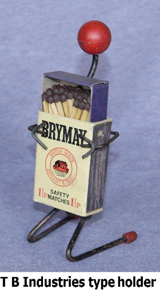
T B Industries type holder (140 x 50 x 50 mm)
Over the years I’ve amassed collections from an eclectic range of subjects including postage stamps, revenue stamps, fiscal documents, embossed crests and monograms, post cards, cigarette cards, beer mats, dice, coins, bank notes, bullets, Magazine of Art Annuals, Majolica green leaf plates, Portmeirion Totem ware, Irish wade ceramics, Holkham Pottery mugs, custard cups, bottles, fossils, rocks and crystals, shells, exotic seed heads, taxidermy, carved ebony elephants, Japanese lacquer ware, plus many sundry items that draw my attention but are insufficient in number to be described as collections.
Bryant & May matchbox dispensers (530 x 65 x 60 mm and 530 x 95 x 60 mm)Some curious striking tubes (58 x 38 x 25 mm)A match striker (150 x 80 x 110 mm)
Top of the list as my main and most extensive collectable interest is matchbox labels and other match related items especially the obscure and unusual.
The Phillumenist magazine ‘s tenth anniversary edition in 1950 included an article entitled “Our Average Reader”. Here’s what it said, which makes fascinating reading and an interesting comparison to today :
Our average reader is 38, has 10,828 different labels, and has collected abroad. He picks up boxes fresh to him in the street, also collects mint and damaged labels, and keeps ancient boxes intact. He started the hobby on his own initiative, keeps his labels hinged in albums by paper hinges, and classified by countries of manufacture. He calls himself a phillumenist, corresponds with collectors at home and abroad (chiefly Czechoslovakia), will reply quickly. He spends 5½ hours a week on the hobby, keeps his “Phillumenist” magazines, started collecting in 1936, and reads the magazine from page one. He has Cruse’s book, and has entertained a fellow collector at home. He has this magazine as far back a 1944, specialises in Swedish brands, has most labels of Sweden and rarely any from Russia.
The Phillumenist magazine, 10th Birthday edition, 1950
We are pleased to announce that the London meetings at Sheen Lane Centre will be going ahead, starting on 3rd October. Sheen Lane Centre have informed us that they are compliant with all the necessary Covid regulations, and that our meetings can go ahead as planned.
Full details of all Society Events can be found on our Eventspage.
I have residency in Lisbon, Portugal but I am currently living in Växjo, Sweden.
I was born in 1955 and started collecting matchbox labels and matchbooks when I was about 4 years old. Knowing about my interest in the hobby some of the phillumenists in the city of Porto encouraged me with some interesting offers. The publication in 1962 of the first catalogue of matchbox labels in Portugal allowed me to properly organize my collection. The 2nd edition of the catalogue published in 1965 and the monthly edition of the magazine “Filumenismo” gave a great boost to my development as a phillumenist.
I went on to specialise in all the material related to Portugal or that circulated in the Portuguese market and its colonies, namely Macau. My collection of Italian matchboxes/panels that circulated in Portugal in the 19th Century is very significant and formed the basis of my Exhibit in 2021.
I am a founding partner of the APF – “Associação Portuguesa de Filumenismo” (founded in 1972), and currently its President.
I have published the following phillumenistic works, which can be purchased from APF :
Catalogue of Portuguese Matchbox Labels. Edition 1992 (co-author, text in Portuguese):
Catalogue of Matchbox Labels – Companhia Portugueza de Phosphoros – Series – 1895-1926. 1st edition 2003; 2nd edition 2008; 3rd edition 2020
Catalogue of Matchbox Labels – Portugal – XIX century. 1st edition 2011; 2nd edition 2014; 3rd edition 2022
Catalogue of Italian Matchboxes imported by Portugal – XIX century. 1st edition 2013; under publication 2nd edition
Addendum to the Catalogue of Matchbox Labels – Macau – 2016 edition (co-author, text in Portuguese)
Advertising Skillets and Bookmatches List – Macau – 2016 (co-author, text in Portuguese)
Phillumeny records – Portuguese Phillumeny Exhibitions – 2022
Phillumeny records – Portuguese Phillumeny Catalogues and publications – 2022
Phillumeny records – Matchbox labels produced abroad to Portuguese speaking territories – 2023
Phillumeny records – Postcard in Phillumeny – 2023
Portuguese matchbook holders records – 2023
Matchbox holders (grips – slides – match safes) records – Portugal – 2023
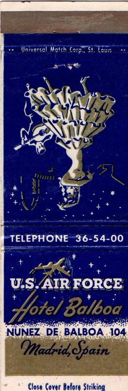
In 1955 there was a joint military base of the American-Spanish army in Torrejón de Ardoz, a town near Madrid. For senior military officials, the American army rented or bought (I don’t know exactly which) a hotel that was located very close to the house where I lived – the Hotel Balboa.
American Bookmatch for Hotel Balboa
I had to walk past this hotel every day on my way to the Institute where I was studying, and I started noticing and then collecting the matchboxes that the soldiers threw down on the ground when they had used all the matches. These boxes came from the supermarket inside the base which sold only American products.
Some Diamond Match Company bookmatches
This is how I started to acquire the wonderful series of “Circus Day”, “Homes of Great Americans”, “The Old West”, “American Folklore” and other examples from Diamond Match Company. Later, I naturally started collecting Spanish labels which became my specialism and passion, but always finding room for a few interesting items from other countries.
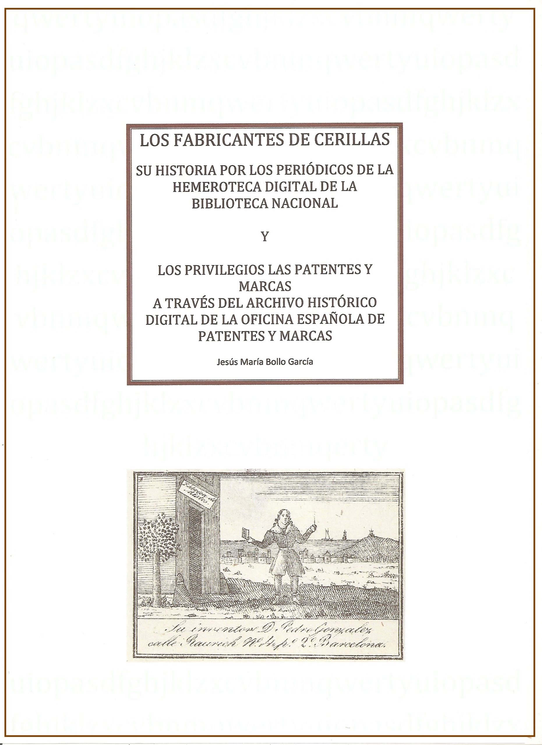
My book, Los Fabricantes de Cerillas
In 2018 I published “Los Fabricantes de Cerillas” a 2-volume illustrated book which describes the history of the Spanish Match Industry from 1834 to 1899 based on the archives of the Digital Newspaper Library of the National Library and the Historical Archive of the Spanish Patent and Trademark Office.
At the moment I am preparing a Catalogue of the Manufacturers of Spanish matchboxes, although given the complexity of the subject and the difficulty of finding information about these manufacturers I realise that the Catalogue may never see the light of day.
It was 1960 when as a 9-year-old boy walking to school that I kicked over a matchbox in the gutter only to find that it had a picture on it (Brymay Birds & Animals issue) so took it to school, showed my mates and we started collecting. They soon lost interest and so I acquired their holdings to complete my set.
Article from “Observer” February 1970
I had a Great Aunt in the UK who also sent me labels and so my collection slowly grew. The labels were soaked off and pasted in an exercise book.
In 1967, I learnt of the existence of the Australian Match Cover Collectors Society (AMCCS) through a work colleague of my late father at Parker Brothers Bakery who took his son to the meetings. This was to be the start of a life-long passion for the hobby.
In 1970, this Profile was published in the AMCCS magazine, the Observer and yes, I did meet a “little Miss” marrying Dianne in 1977. Children followed in 1981 & 1983 and three grandsons in 2014, 2019 & 2020.
COMMITTEE SERVICE, ETC.
Secretary AMCCS (SA) 1984-1986
President AMCCS (SA) 1987 to present
Observer Editor May 1990 to February 1999
Life Membership AMCCS 2002
Honorary Life Membership (International) Bangladesh Matchbox Collectors Club 2022
Observer Distributor since 2009
Annual Postal Auction Coordinator since 2009
Coordinator of National Match Exhibitions held in Adelaide in 1999, 2003, 2009, 2014, 2018, 2021, 2022, 2023 and 2024
Attendee & Trader at BML&BS Exhibitions held in 2000, 2005, 2009 & 2017
SPECIALISATION AREAS
Collecting areas for labels, booklets & skillets are Australia, New Zealand, Papua New Guinea & South Africa. World-wide hardware produced by or for the match manufacturers together with any ephemera allied to the match industry, particularly picture postcards are also collected.
PUBLICATIONS & ARTICLES
Author of –
Duncan’s of Australia
E.L. Bell & Co, Australian Match Works & Commonwealth Match Works
Co-Author/Contributor to –
Bryant & May Australia Parts 1 & 2
Federal Match Company, Australia
Redheads Skillets
Plyfiber, Australia
The Cheapies (Imports to Australia)
New Zealand Catalogue 2023
Numerous articles in the Observer, Match Label News & IMSA News
I have been a collector for over 30 years. My early interest involves numismatic and philatelic items.
About 8 years ago, I started to pursue phillumeny interest in earnest. Why? As a collector, I was looking for tantalizing factors of something being interesting, teasingly challenging, valuable, historically beneficial perhaps or artistically profound, with the bottom line being simply: satisfying and fun. Phillumeny satisfies all those criteria.
Some famous imported match labels of “Elephant & Cock” from Sweden by Paterson Simons & Co Ltd for use in Straits Settlements (Straits) and Federated Malay States (FMS) which are now Singapore and part of Peninsular Malaysia
My phillumeny collection is geographically focused towards anything Malaysia, Singapore and Indonesia originated or related.
I am Anthony Harris, age 21 and have been collecting Road Transport match related items for over 10 years. All the phillumenists I have met have been supportive and I am particularly grateful to the encouragement and ongoing ‘gifts’ toward my collection that I receive from Ray Gustard, Tom Gibbard and Paul Dearie and of course my dad Rupert.
I am passionate about bicycles, motor bikes and cars, in fact all transport that travels on the road. I am a fully qualified vehicle mechanic and own a track race car as well as a road car. I have gone to many of the national race circuits of the UK as a mechanic for a racing car team that has cars in the British Touring Car Championship. When not working for Audi, I am very often fixing friends cars on my dad’s drive. It often looks more like a garage than a drive.
A new Exhibition has opened in London, entitled “Always a Show” by Aaron Kasmin, which features works of art inspired by recent American feature matchbook discoveries.
It is at the Sims Reed Gallery and runs from from 16 September – 28 October 2021.
The exhibition showcases twenty-nine new pencil drawings created during lockdowns, which portray vibrant scenes from the post-prohibition era.
Everyone attending the meeting on Sunday 3rd October is asked to observe the following Covid guidance, in order to comply with the Risk Assessment.
Notices will be fixed to the outside of the fire door to the car park. and to the door in the lobby advising re symptoms, face covering and hand sanitising.
A supply of spare masks will be available for those who arrive without.
There will be up to 50 attendees, and social distancing will be observed. The age group of attendees means that most will have had two vaccinations, and some will have had a third.
A one-way system will be in place, and having the fire door to the car park open will also allow for ventilation.
Sanitizing sprays will be available at both doors and in the toilets.
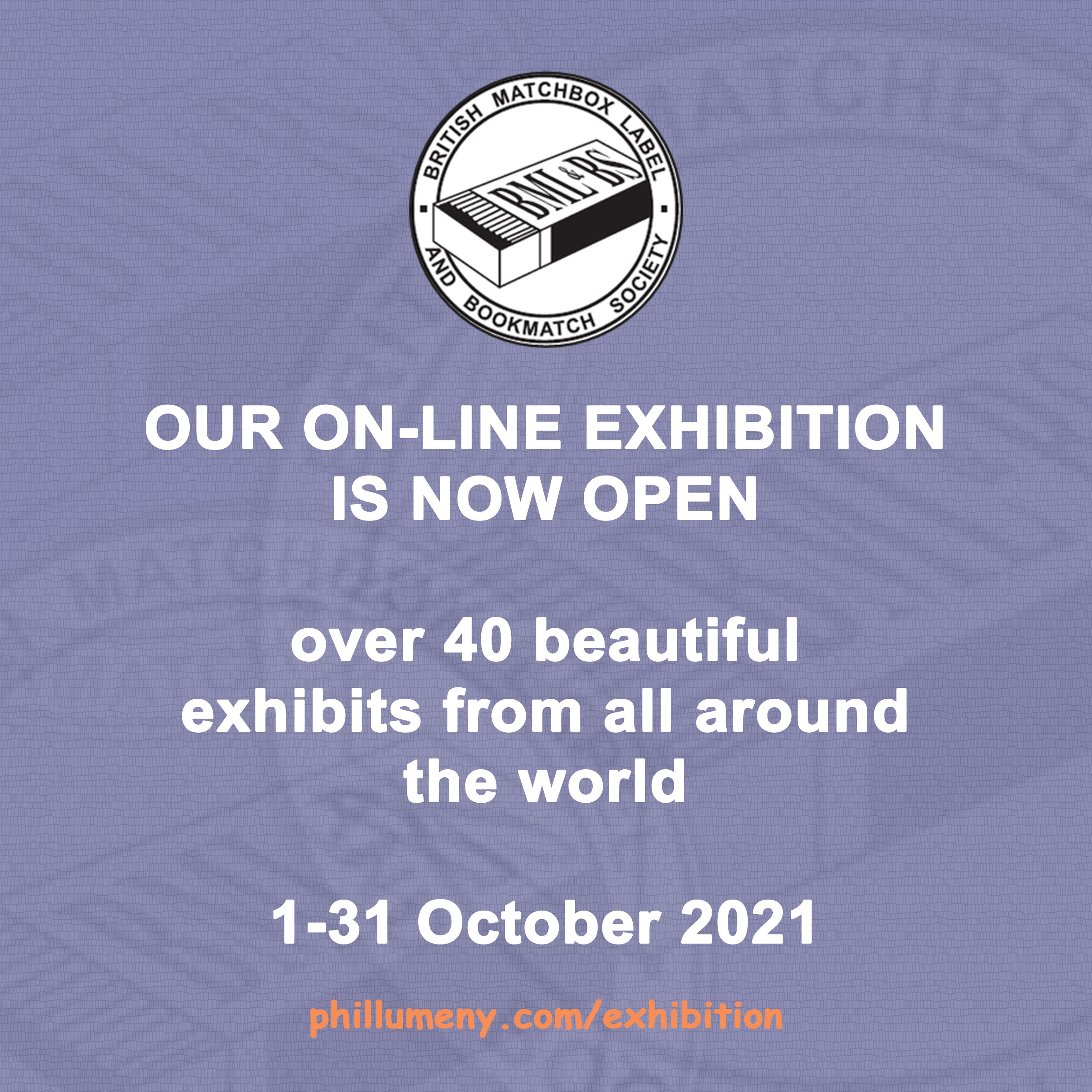
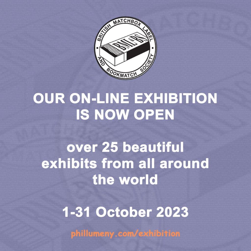
Our first On-line Phillumeny Exhibition opened its doors at 09:00 UK time on 1st October and runs for the entire month. It is jam-packed full of beautiful, exciting Exhibits from all over the world showing the full breadth of our hobby. Visit the Exhibition here.
Our third On-line Phillumeny Exhibition opened its doors at 07:00 UK time on 1st October and runs for the entire month. It is jam-packed full of beautiful, exciting Exhibits from all over the world showing the full breadth of our hobby. Visit the Exhibition here.
Our first On-line Phillumeny Exhibition ran from 1st October to 31st October 2021 and was an unqualified success, attracting over 2000 visitors during the month. We had over 40 exciting Exhibits from members across the world, covering the whole breadth of our hobbyon topics such as murder, fire, railways, tigers, postcards, and mandolins, and including a huge amount of never-before-seen material. The Award winners will be announced shortly and will go into a Permanent Gallery on our web site.
We have already started preparing for next year’s Exhibition, which will again take place in October.
Here is our Exhibition Catalogue. The Exhibits are listed in alphabetical order, click on a link below to access an Exhibit or read an Exhibitor’s biography. An asterisk indicates that the Exhibit is available in dual language.
Enjoy our Exhibition, and we encourage you to sign our Visitor Book and let us know what you think and don’t forget to vote for your favourite Exhibit.
Following our successful 2021 On-line Phillumeny Exhibition, the three Award winners have now been announced and their Exhibits can be seen in our Permanent Gallery.
The Award winners are :
The President’s Award winner is “The Tigers of Malaya” by Badrul Hisham Jaafar
The Members’ Award winner is “Murder on Fuencarral Street” by Jesús María Bollo García
The Committee’s Award winner is “Hi-no-Yojin” by Takeshi Yokomizo
Bryant & May’s winter competition runs until 17th January 2022. It is being held to celebrate the launch of their new winter packaging, and the company is giving people the chance to win a winter bundle worth up to £200 – they will give the winner a selection of hampers to choose from.
To enter the competition, people should submit their best photo of the new B&M packaging. Full details and an entry form can be found here on their website.
Cheshire Stamp Auctions will be selling a very small portion of Robin Hunt’s ephemera and memorabilia collection on 12th February 2022. The listings will become available here on their website towards the end of January. The items being auctioned include a sizeable collection of Royalty-based philately, and an extensive accumulation of Royalty-themed matchbox labels, with some very strong representation from the reigns of Victoria and Edward VII onwards.
This year’s Annual General Meeting (AGM) will take place on Sunday 10th April during the Society Meeting in London. The agenda will be published in the April magazine, and members are invited to vote on the Resolutions.


 Japan export to India, Meiji – Taisho era
 Japan export label, Meiji – Taisho era
 Japan pro-war propaganda label, WWII
 Japan pro-war propaganda label, WWII