A new Exhibition has opened in London, entitled “Always a Show” by Aaron Kasmin, which features works of art inspired by recent American feature matchbook discoveries.
It is at the Sims Reed Gallery and runs from from 16 September – 28 October 2021.
The exhibition showcases twenty-nine new pencil drawings created during lockdowns, which portray vibrant scenes from the post-prohibition era.
Everyone attending the meeting on Sunday 3rd October is asked to observe the following Covid guidance, in order to comply with the Risk Assessment.
Notices will be fixed to the outside of the fire door to the car park. and to the door in the lobby advising re symptoms, face covering and hand sanitising.
A supply of spare masks will be available for those who arrive without.
There will be up to 50 attendees, and social distancing will be observed. The age group of attendees means that most will have had two vaccinations, and some will have had a third.
A one-way system will be in place, and having the fire door to the car park open will also allow for ventilation.
Sanitizing sprays will be available at both doors and in the toilets.
This exhibit focuses on the Tiger theme of match labels manufactured or used in the Federated Malay States, Malaya and Sarawak (all part of Malaysia). It is reported by the World Wildlife Fund (WWF) group that the Malayan Tigers are so endangered with less than 300 Malayan Tigers in the world of which only about 200 left in the wild. Let’s save our beautiful endangered tigers while enjoying the artistic match label designs of yesteryears.
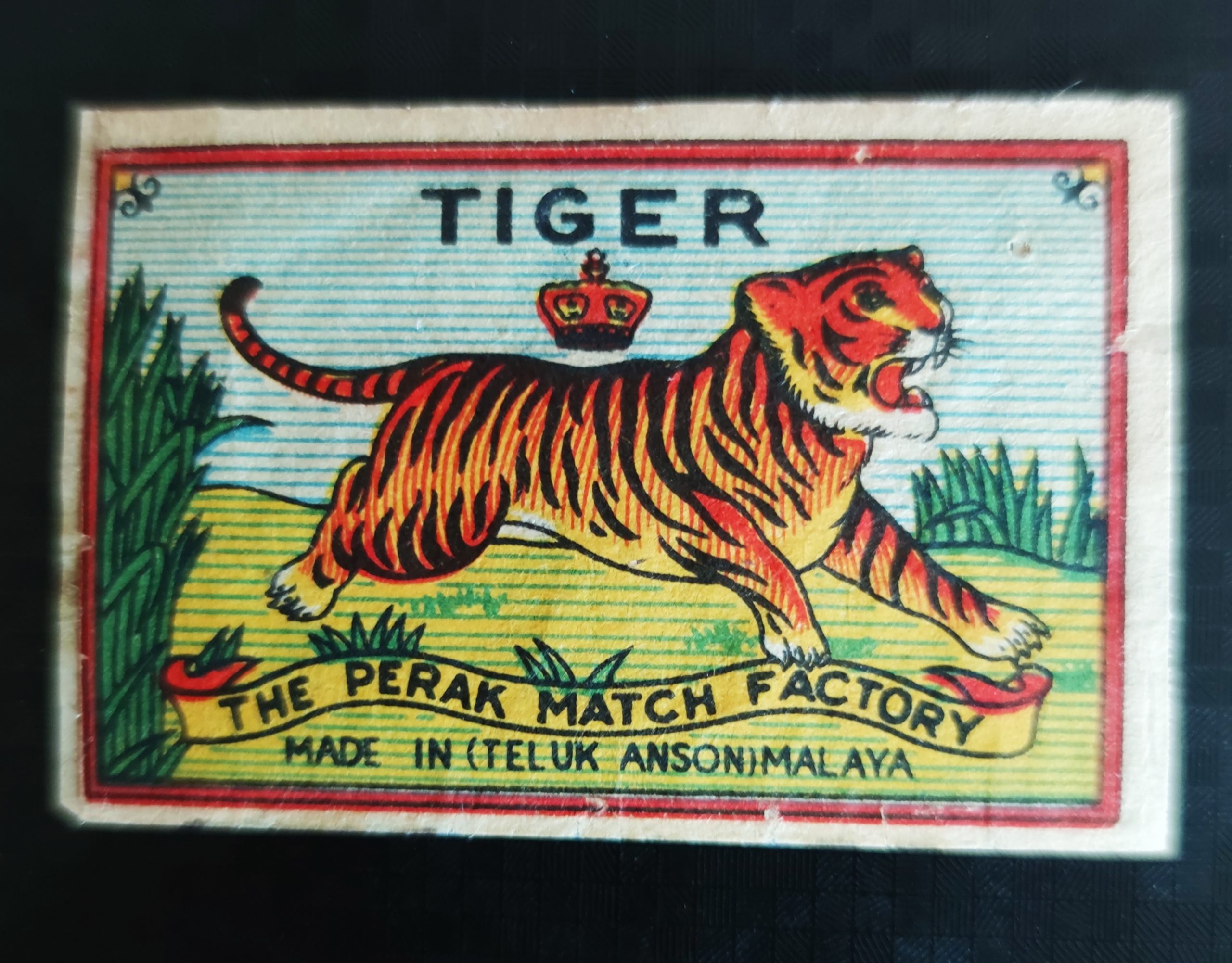
Red Tiger matchbox label, 50 x 35 mm
The red coloured tiger label on the right is reputed as the first ever locally manufactured match brand of 1922 by the Malayan Matches Ltd of Selangor in the Federated Malay States (FMS). Prior to this all matches in Malaya were imported by local traders, particularly from Sweden, Great Britain, Japan, China and others. The tiger image has similar resemblance to that of a Malaya postage stamp. After enquiring, I realised that it was a matchbox label but unfortunately it was not for sale – it was the shop owner’s favourite and he was keeping it for himself. Some things, money just could not buy. To be honest, I didn’t dare to make an offer anyway. To me that’s an example of real love; an attachment.
That fateful event was the start of my eventual journey into phillumeny. After some years, I managed to acquire this beautiful red tiger label from a French collector. The rest, as they say, is history.
Tiger Head, 35 x 54 mmTwo Tigers, 35 x 54 mm
Tiger is a famous and important theme for Malaya. Evidently, it was used as a brand to symbolise courage and strength.
In 1933, Kelantan Match Factory (KMF) was established and interestingly, the company, still produces matches in Kota Bahru, Kelantan till this very day.
It has a reputation as one of the most prolific and famous local match manufacturers. Tiger Head and Two Tigers are two of KMF’s brands, more are shown in the gallery below. Various other tiger labels from KMF and variants do exist.
Tiger, 54 x 35 mm
Back in the old days, rumours were rampant that Britain’s Bryant & May was considering a manufacturing set up in Perak, Malaya to take advantage of the abundance of wood and the new hydro-electric infrastructure. The rumours remain unrealised.
Instead, in 1936, the Perak Match Factory (PMF) was established. Their early label designs are quite similar to Kelantan’s KMF as they share common shareholders.
In late 1940s, Sarawak Match Factory was established in East Malaysia but ceased operation sometime in the mid-1960s.
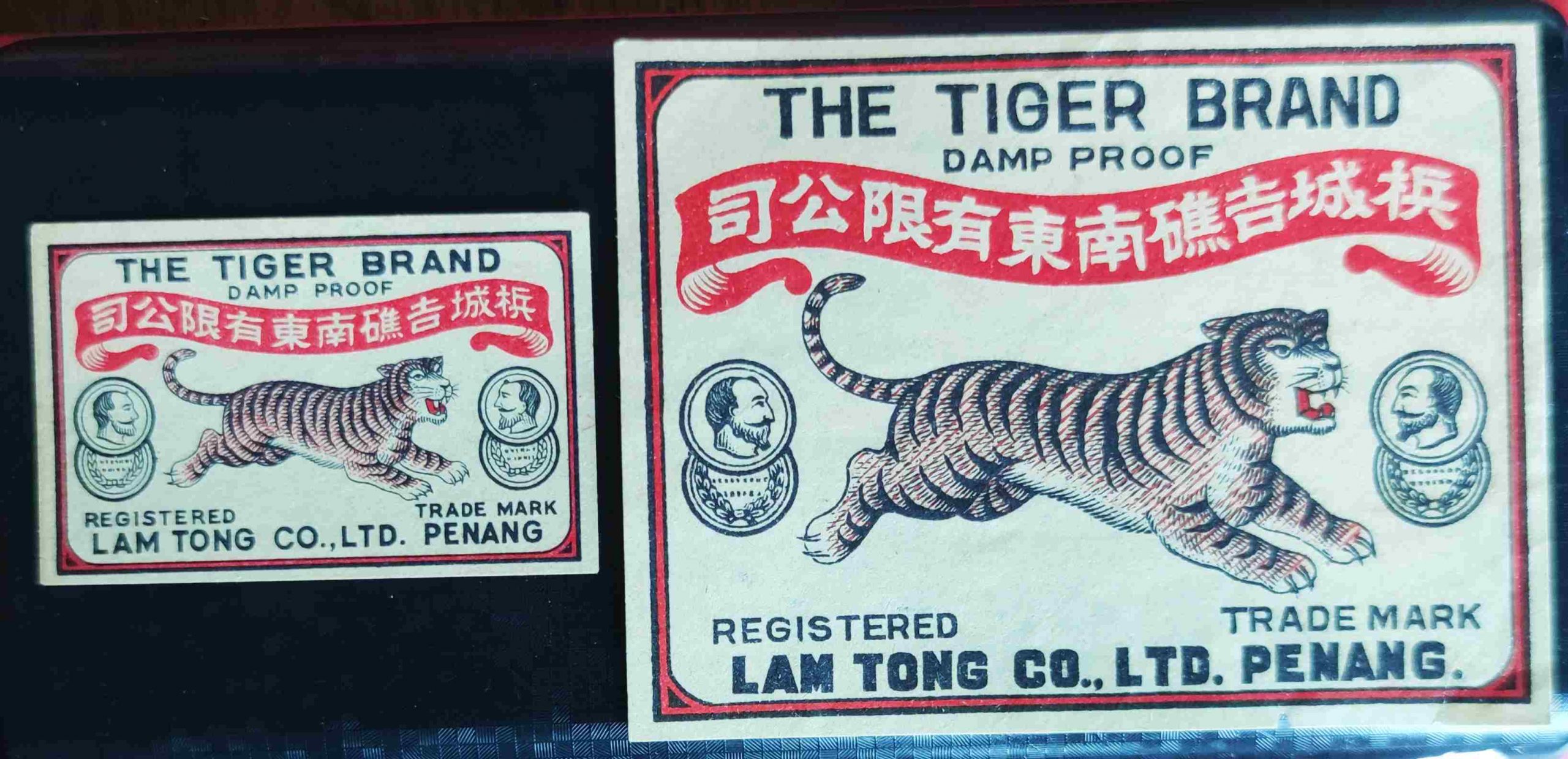
Tiger Brand, imported, 55 x 35 mm and 90 x 68 mm
Imported matches were also in abundance and Penang’s Lam Tong is one such fine example. The matches were imported from Hong Kong.
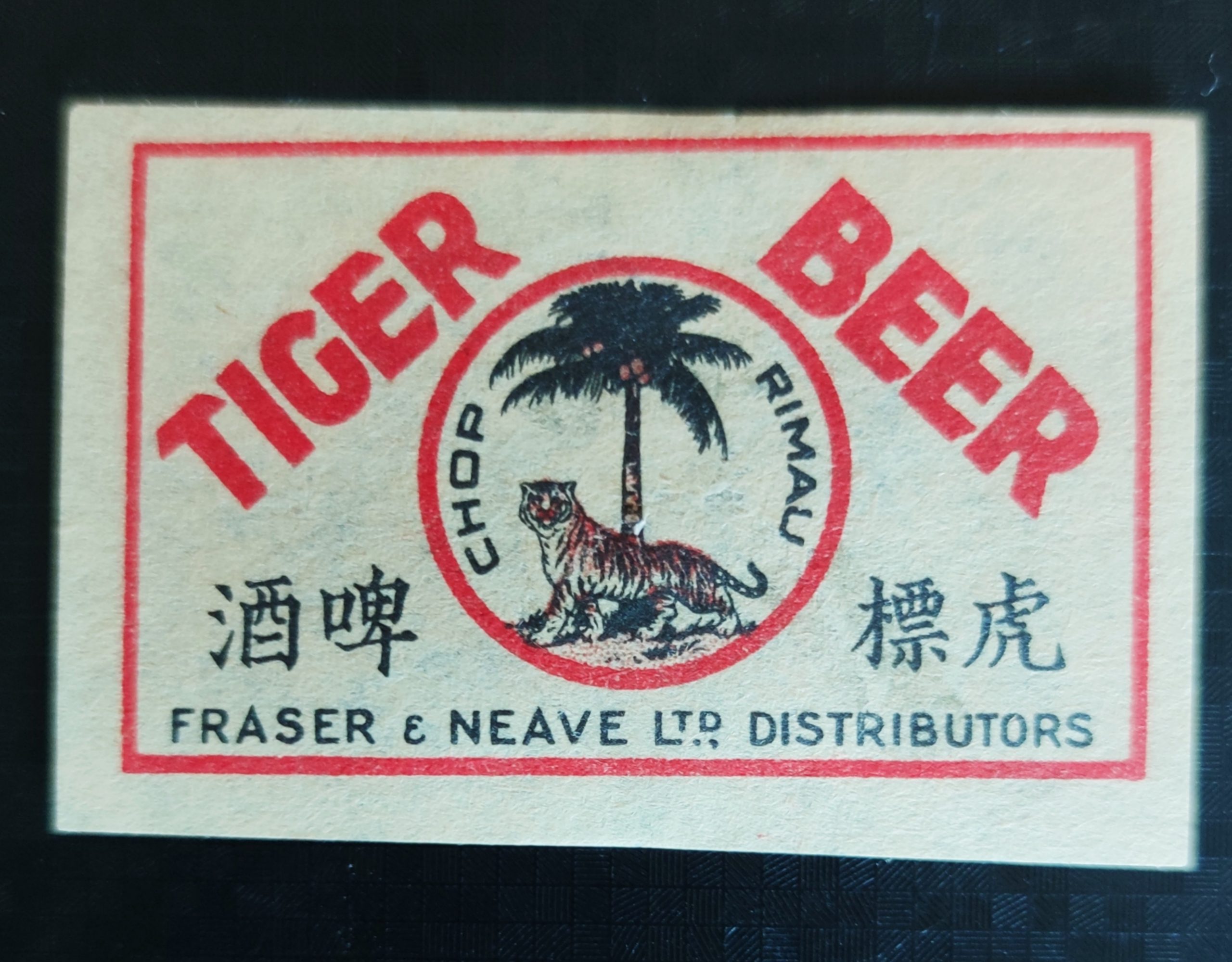
Tiger Beer label, 57 x 36 mm
The tiger is considered an iconic brand for various products. One particular example is the Tiger Beer. On the right is a matchbox advert for Tiger Beer by Fraser & Neave Distributors (F&N) branded locally as Chop Rimau (the word “Chop” means brand while “Rimau” a shorten form of “Harimau” or Tiger in Malay language).
Some more Tiger labels are shown below, click on an image to enlarge it.
A card-outer label from Garay y Arregui, 1889 (note: not depicting the crime) 116 x 45 mm
This is the story of an horrific murder which was committed in Madrid in 1888, and the famous trial which followed, as shown on contemporary matchboxes manufactured by Garay and Arregui who quickly spotted an opportunity to boost sales by using images of the protagonists on their boxes.
Note : single labels are shown below but unfortunately I do not have a complete box from this series. However, on the right is a card-outer label from a different series produced by Garay y Arregui in 1889.
The Crime
Doña Luciana Borcino de Varela
It was 2:30 in the morning on the 2nd of July 1888 when the residents of 109 Calle de Fuencarral raised the alarm, after they heard shouting from the second floor flat followed by thick black smoke coming from a window. The police broke down the door and discovered the body of Doña Luciana Borcino de Varela lying dead in her bed, face up. She had been stabbed three times in the chest, and her body was wrapped in wet oily rags which had been set alight.
In the room next door they found her new maid servant, Higinia Balaguer Ostalé, lying unconscious on the floor lying next to a sedated bulldog.
José Vázquez-Varela
Doña Luciana Borcino de Varela was a wealthy widow, 50 years old, who lived in the flat with her feckless son José Vázquez-Varela, 23 years old, who was always asking his mother for money. He was currently in the Cárcel Modelo prison for the third time after committing another misdemeanor. He had previously been in jail for hitting his own mother and on another occasion for slashing his girlfriend Dolores Gutiérrez with a razor. Doña Luciana was known as a strong, severe woman who had difficulty retaining servants – Higinia had only been with her for six days. The autopsy showed that one of the stab wounds had been fatal, and that she had been burned after she was dead.
Higinia Balaguer Ostalé
The police arrested Higinia as the prime suspect and sent her to the Women’s Prison, although the motive for the crime was unclear. Higinia said that when she returned to the flat on the evening of 1st July Doña Luciana was with a man and they told her to go to bed, then when she woke up the flat was full of dense acrid smoke. In one of four different confessions she made Higinia accused José of committing the murder, saying that he had threatened her with violence and offered her money telling her to buy the petrol, clean up the blood and burn the body. But how could he have committed the murder when he was in prison ?
Sr. Millán Astray
Higinia had arrived at Calle Fuencarral recommended by Sr. Millán Astray. He was the interim director of the Cárcel Modelo and had previously employed Higinia as his maid. It was also common knowledge that prisoners were able to leave the prison whenever they wanted to, and José had often been seen in the streets.
The Trial
The Trial commenced on 26th March 1889, and was notable because it was the first time that “Acción Popular” was used in a Spanish court, allowing any Spanish citizen to appear as a witness even if they were not directly involved in the crime. The Newspaper Editors enthusiastically exercised this right, because they considered that the Trial was full of irregularities and suspected political motives in the background. The Newspapers started reporting court proceedings for the first time and this Trial was big news.
Higinia was the central character in the Trial, a good-looking illiterate girl of 28 years, who achieved a certain notoriety not only because of her ‘star performances’ in the dock but also because she changed her statement four times – from accepting sole responsibility for the murder to accusing others.
Dolores Ávila (“Lola la Billetera”)
The prosecution decided that Higenia must have had help to commit the crime, and that her motive was robbery. She identified her friend Dolores Ávila (“Lola la Billetera”) as a collaborator and the actual murderer, but in her final testimony Higinia stated that José killed his mother, and that Sr. Millán had planned the crime, and they paid her generously for letting them into the flat. Also, records show that Sr. Millán spoke privately with Higinia in prison and also with Dolores after she had been incarcerated, both of which were highly irregular.
Many aspects of the case remained unexplained – where was the murder weapon, how was the dog tranquilized, and whose were the five cigarette butts on the floor near the body (Higinia didn’t smoke) ?
The Verdict
The Trial concluded on 29th May 1889, with a verdict of Guilty of Murder and Robbery. The judge sentenced Higinia to death by Garrote Vil, Dolores to 18 years in prison as accomplice and absolved José and Sr Millán of any blame. There was a massive public outcry at the verdict, but it was upheld.
Higinia was executed on 19th June in front of 20,000 people – this was the last public execution to be held in Spain. Just before the executioner applied the garrote Higinia cried out “¡Dolores, 14000 duros!” Soon after, Sr. Millán stepped down from his post, as did the President of the Supreme Court.
This famous case has been made into a film and a TV series, a play, many books and articles have been written about it, and it continues to intrigue criminology students many of whom see it as a huge miscarriage of justice where the rich get away with the crime and the servants take the blame.
Here are more labels with images of other actors in the Trial, click on an image to enlarge it.
From olden days until recently, Japanese houses were mostly built from wood. When towns and cities developed and wooden houses were built densely, fire became an especially big hazard. Wooden constructions prompted fire to spread quickly and people constantly suffered from many conflagrations throughout history. The fear of fire disaster and the importance of awareness of fire prevention were shared by people and communities throughout the country.
“Hi-no-Yojin” was, and still is a popular fire prevention slogan (in English this means “Watch out the fire”). Boxes of matches carrying this slogan started appearing in the early Showa-era (the late 1920’s till early 1940’s), and played a big part in raising people’s awareness of the danger.
The production of advertisement-matches burgeoned in the early Showa-era. Most match factories in Japan were of a relatively small scale and able to accept small orders for local clients. These labels became a good advertising medium for campaigning about fire prevention on a community basis. Some of these fire-prevention match labels featured equipment and symbolic objects relating to fire-fighting.
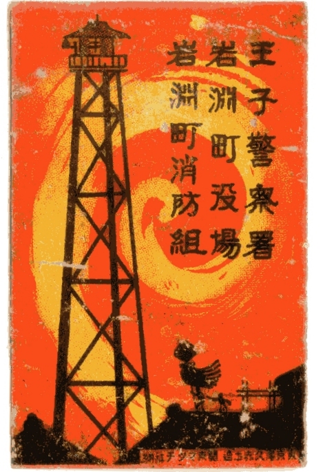
Fire prevention label for Oji Police Station, 37 x 56 mm
From the early 1920’s till 1960’s, fire watch-towers made of an iron framework were installed in every fire station.
A fire watch-ladder together with a fire-pump house were deployed to community-based volunteer fire companies (about 2,400 of them nationwide).
The fire watch-ladder played a key role in raising the alarm by ringing a fire-bell attached to the top of the tower. However, most watch-towers and watch-ladders fell into disuse as houses and buildings became taller.
Night-Watch for fire prevention in the winter started in 1648, in the Edo period. During the winter, a group of locals patrolled their neighbourhood area at night. They struck clappers and called out “Watch out the fire. A single match causes a fire!” while walking. Night-watch has been one of the seasonal traditions in Japan but complaints about the noise of the clapper increased and became an issue.
In the 18th century, the first official fire-company was formed in the capital Edo (Tokyo). It consisted of 48 regional and 16 capital brigades.
Matoi represented each brigade and were used like a flag. Fire-fighters rushed to the site and placed Matoi at the top of the roof showing local people their presence. The 48 regional brigades were mostly identified by the old Japanese alphabet (48 in total) like, “E-brigade, Ro-brigade, Ha-brigade…”.
The installation of fire-alarms in urban areas started in 1920. Modern fire extinguishers were distributed widely but fire-extinguishing buckets are still regularly installed as a basic fire extinguishing tool. The top cause for fire in the capital Tokyo has been careless smoking.
More Fire Prevention labels from the early Showa-era are shown in the gallery below, click on an image to enlarge it.